

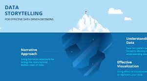
Data storytelling is the technique of utilizing statistics to make an informative and compelling tale. It is a great tool for communicating complicated information in an easy-to-understand and recall style. Data storytelling will account for 75% of information consumption by 2025, according to Gartner.
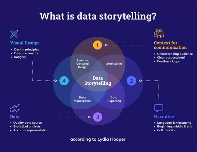
Data storytelling has many applications, including business, education, and governance. It is a useful tool for anybody who wishes to properly convey data. Data storytelling is the process of presenting data insights using narration and visualization.
A data narrative may be told in a variety of ways. To display data, one frequent way is to utilize charts and graphs. Charts and graphs may be used to show data trends, patterns, and correlations. They may also be utilized to emphasize critical points.
Bar charts
Bar charts are used to compare data from various categories.
Line graphs
Line graphs: Line graphs are used to show how data evolves over time.
Pie charts
Pie charts are used to represent the relative proportions of various sections of a whole.
Scatter plots
Scatter plots are used to demonstrate the connection between two variables.
Principles
In addition to charts and graphs, data stories can also be told using text, images, and video. The best technique to communicate a data narrative depends on the data and the audience. Popular data platforms like Tableau and Yellowfin have launched automated data storytelling platforms, which is further increasing interest in this approach.
Whatever method you choose to communicate your data narrative, keep the following ideas in mind:
1. Begin with a specific goal in mind
What do you hope your audience will take away from your story?
2. Maintain simplicity
Make sure your communication is clear, concise, and easy to understand.
3. Use visuals
Charts and graphs may help you tell a more interesting and memorable tale.
4. Narrate a story
Don’t simply show the data. Use your narrative to explain the significance of the facts and why it is important.
5. Be persuading
Use your tale to persuade your audience to act. Data storytelling is a great technique for communicating complicated information in an easy-to-understand and recall style. You may develop data stories that are instructive, interesting, and convincing by following the concepts indicated above.
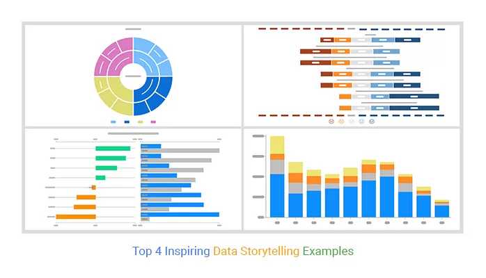
Here are some data storytelling examples utilizing charts:
- A bar chart may be used to demonstrate the quantity of sales of various items over time.
- A line graph may be used to demonstrate how a company’s revenue has grown over time.
- A pie chart may be used to demonstrate the proportion of clients who are happy with a product or service.
- A scatter plot may be used to demonstrate the link between a product’s price and the number of units sold.
These are just a few ways charts may be used to illustrate data stories. You may create visually informative and compelling graphics by selecting the proper chart for the data and the narrative you want to convey.
Conclusion
Data storytelling is a great technique for communicating complicated information in an easy-to-understand and recall style. You may develop data stories that are instructive, interesting, and convincing by following the concepts indicated above. This technique is trending largely because it helps businesses present and act on complex information. Interest in data storytelling is predicted to see significant future growth.
There are several resources accessible online and in libraries if you want to learn more about data storytelling. Courses and seminars on data storytelling are also available from universities, corporations, and other groups.
You can learn to tell data tales with a little effort, which can help you successfully convey your ideas and make a difference in the world.